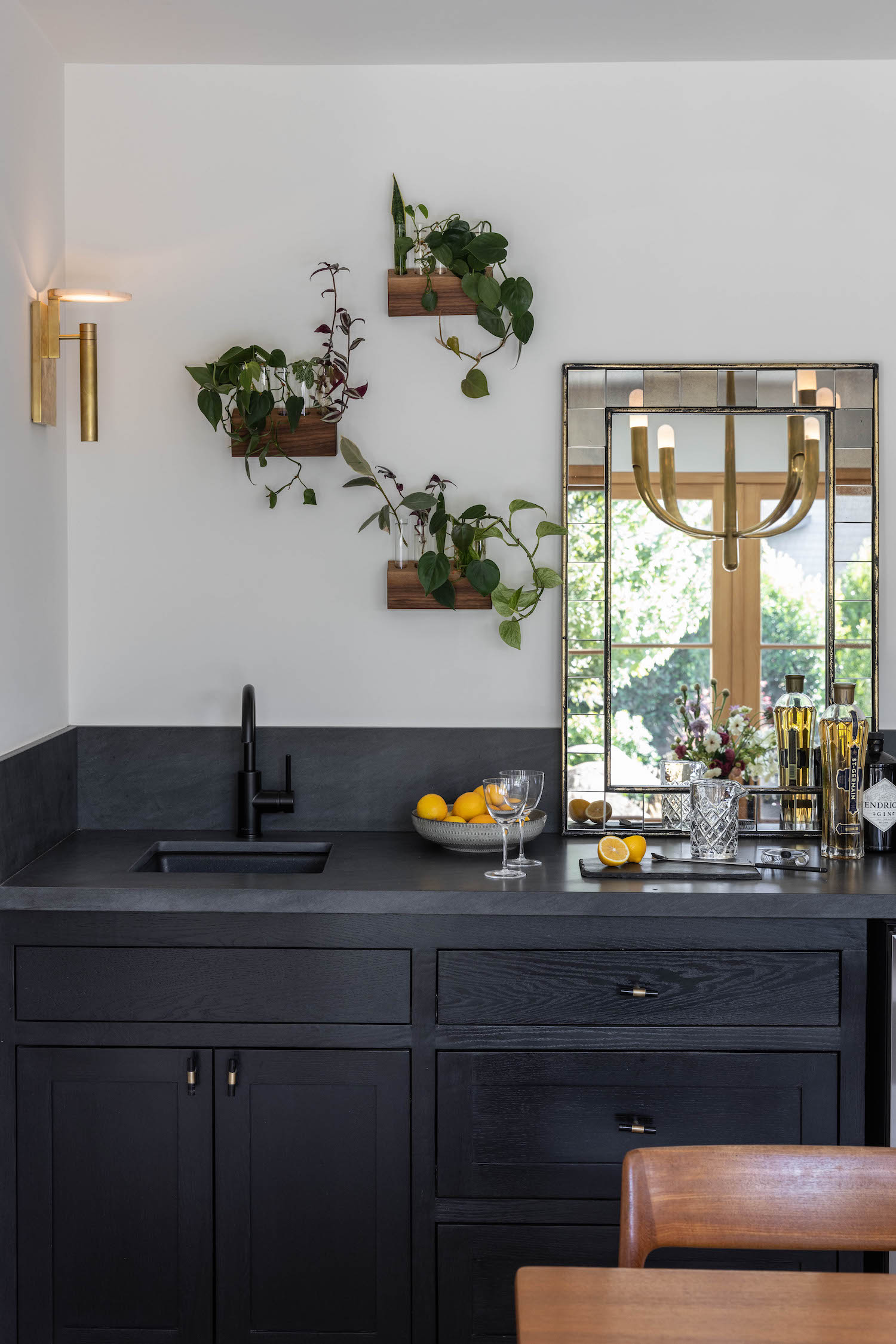
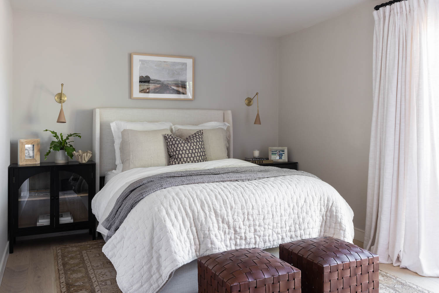
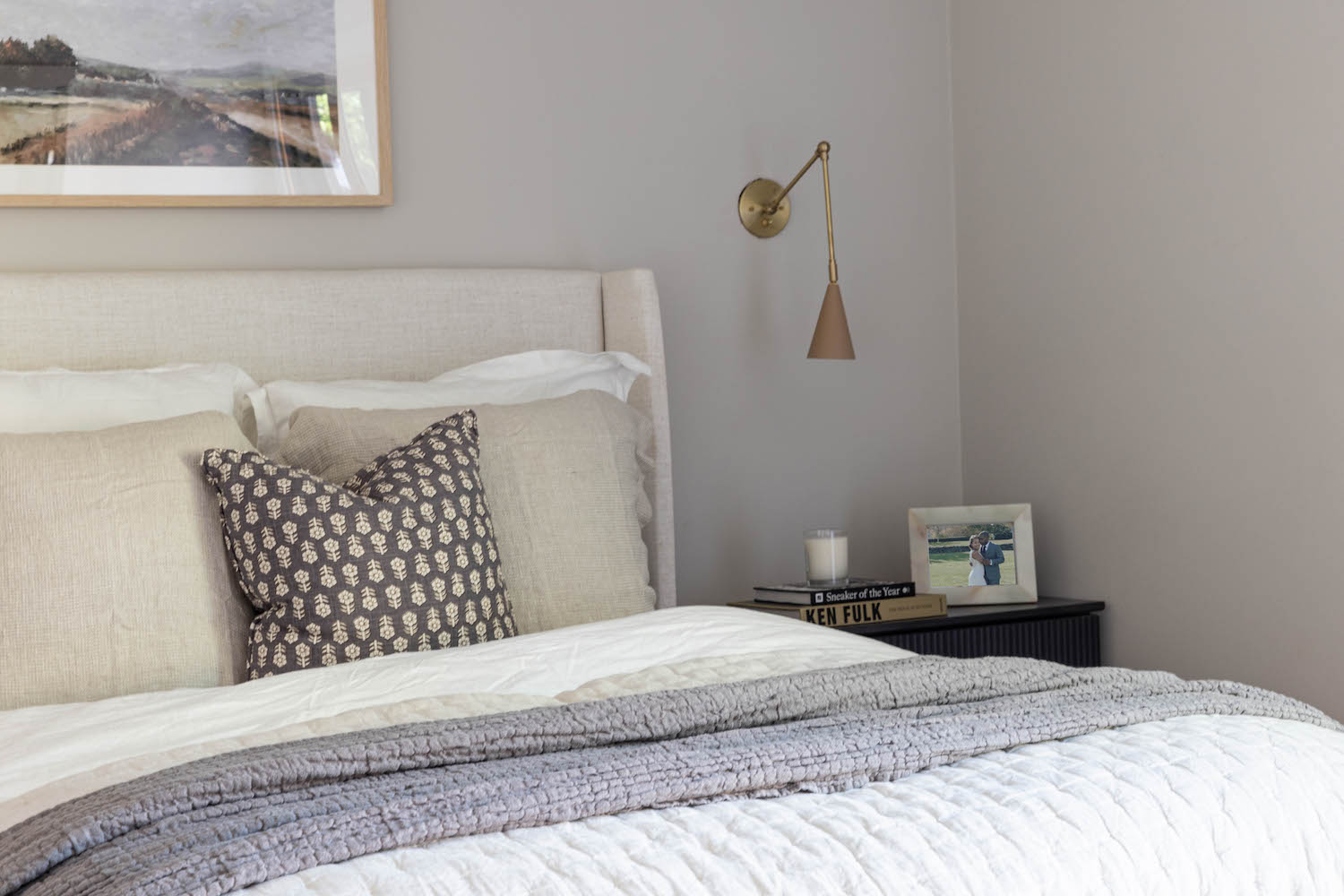
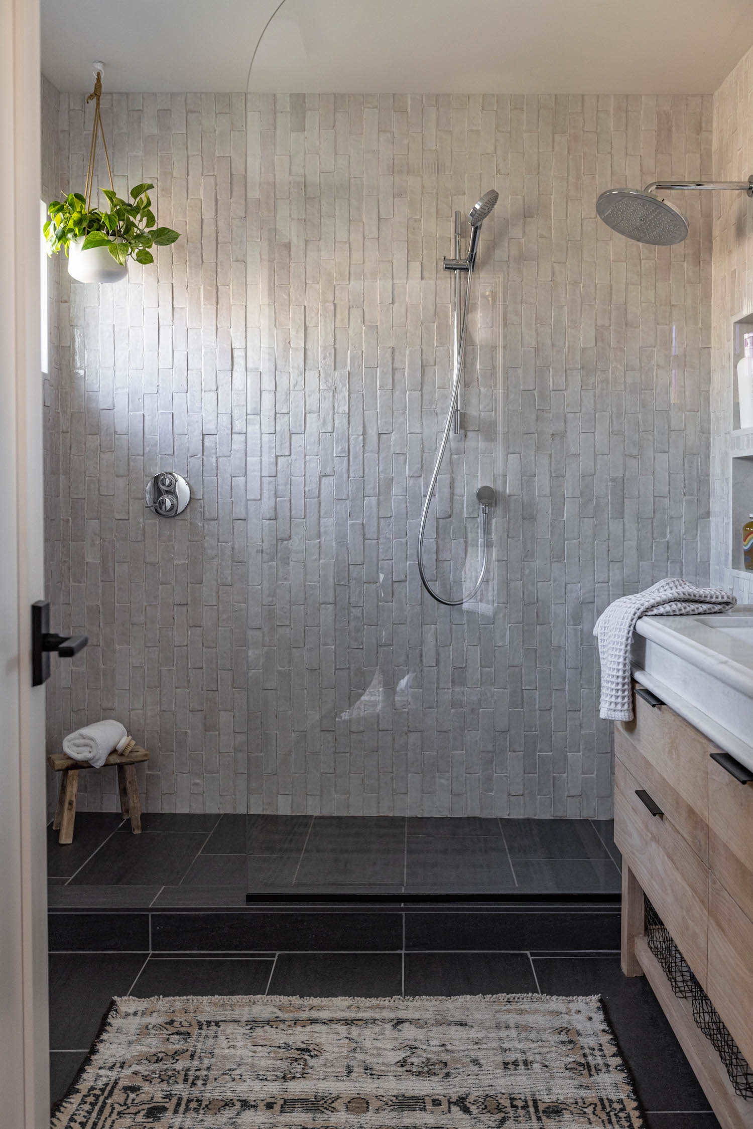
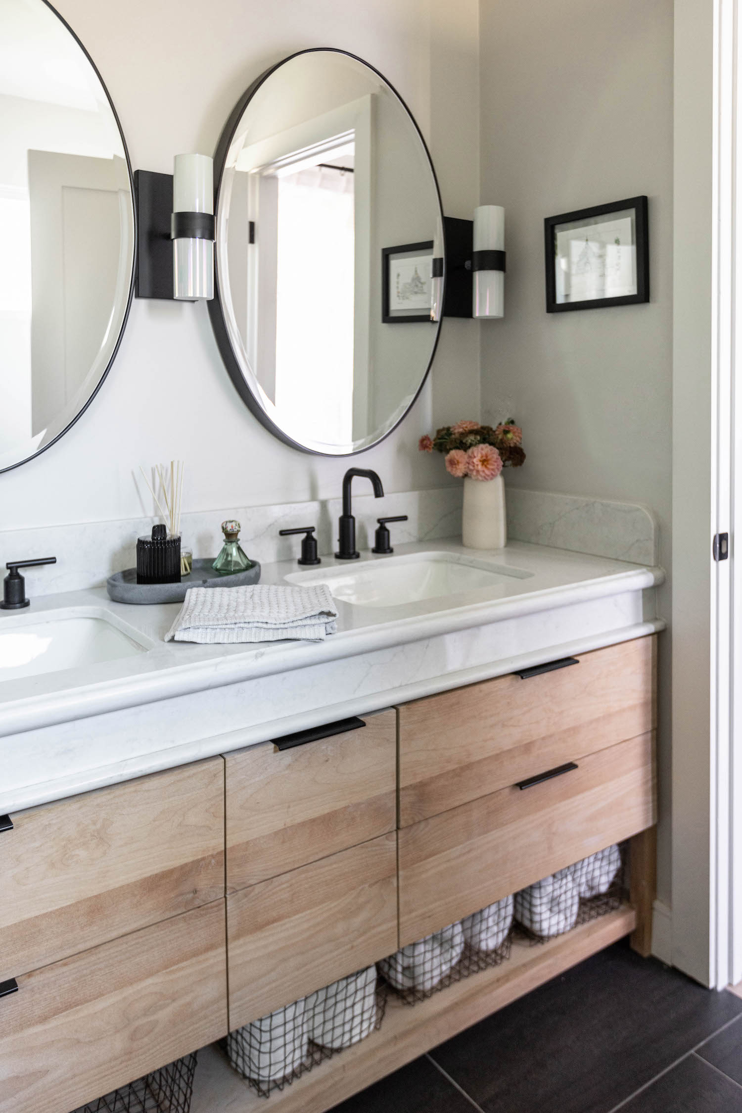
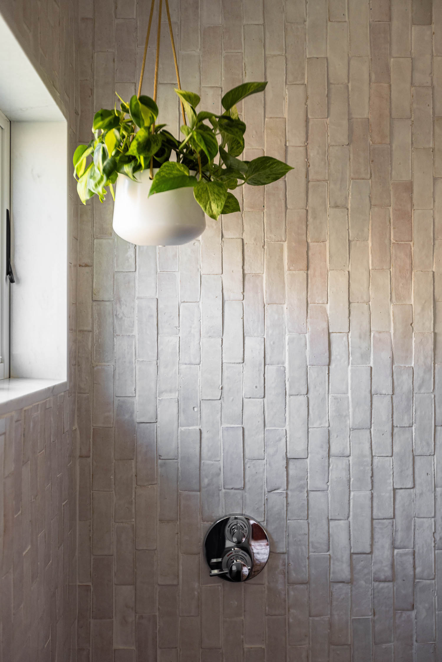
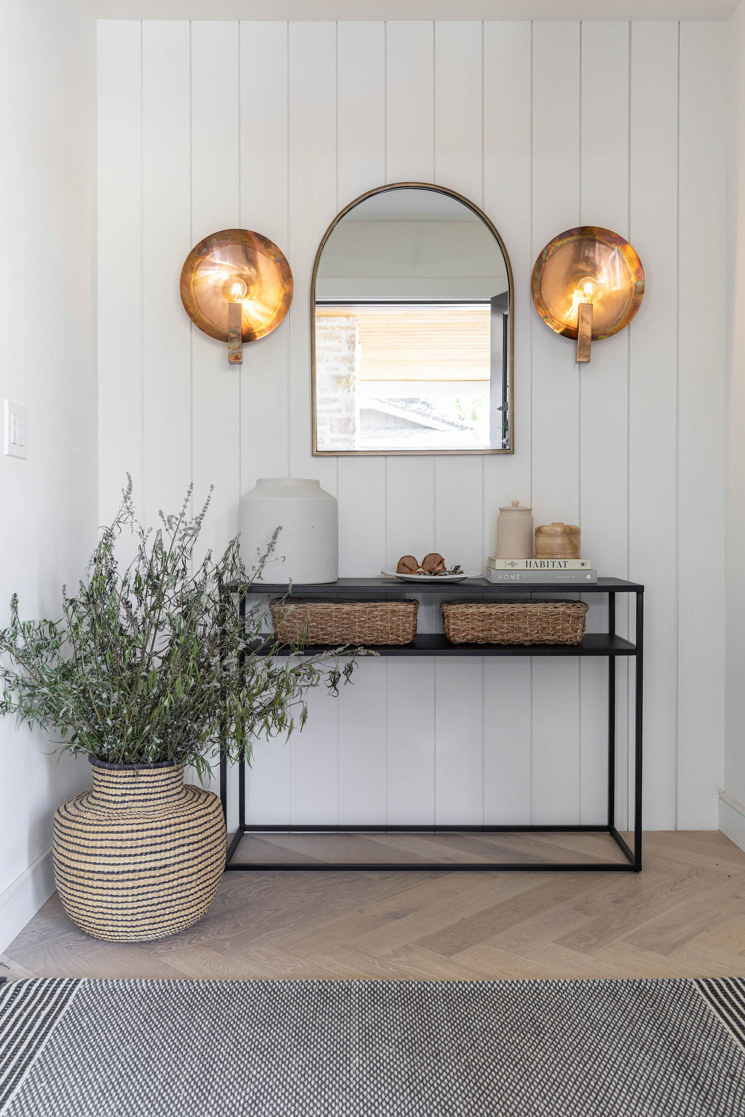
To live in a state whose weather is constantly beckoning you to come outside may be the reason this family chose to move to California. But designer, Kendra Joseph of Rise Up Home, took it one step further and decided to bring the outdoors in. Gorgeous natural textures and pops of greenery create an open and airy home that feels even larger with the perceived walls between indoor and outdoor removed. Sen Creative captured the light and earthy elements that make this home shine, check them out below!
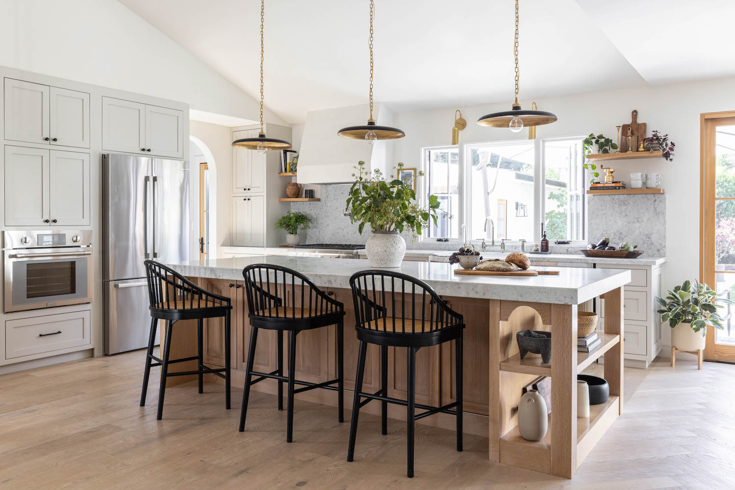
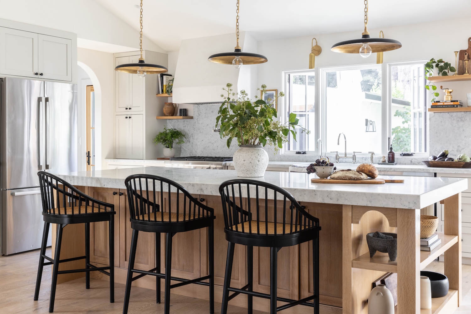
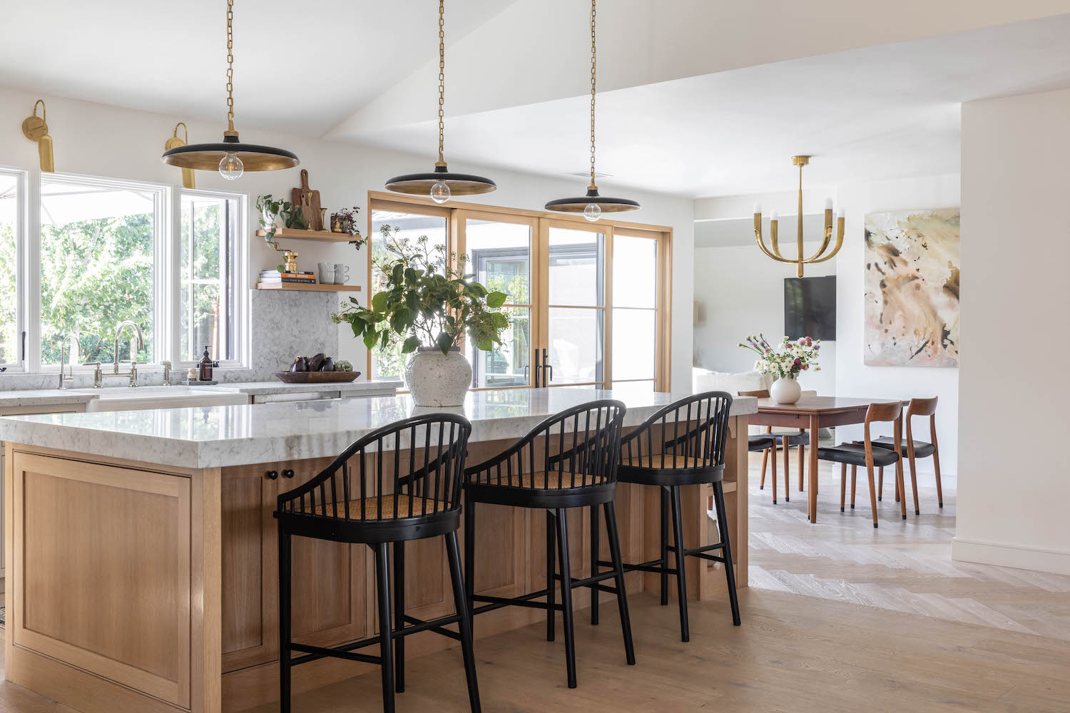
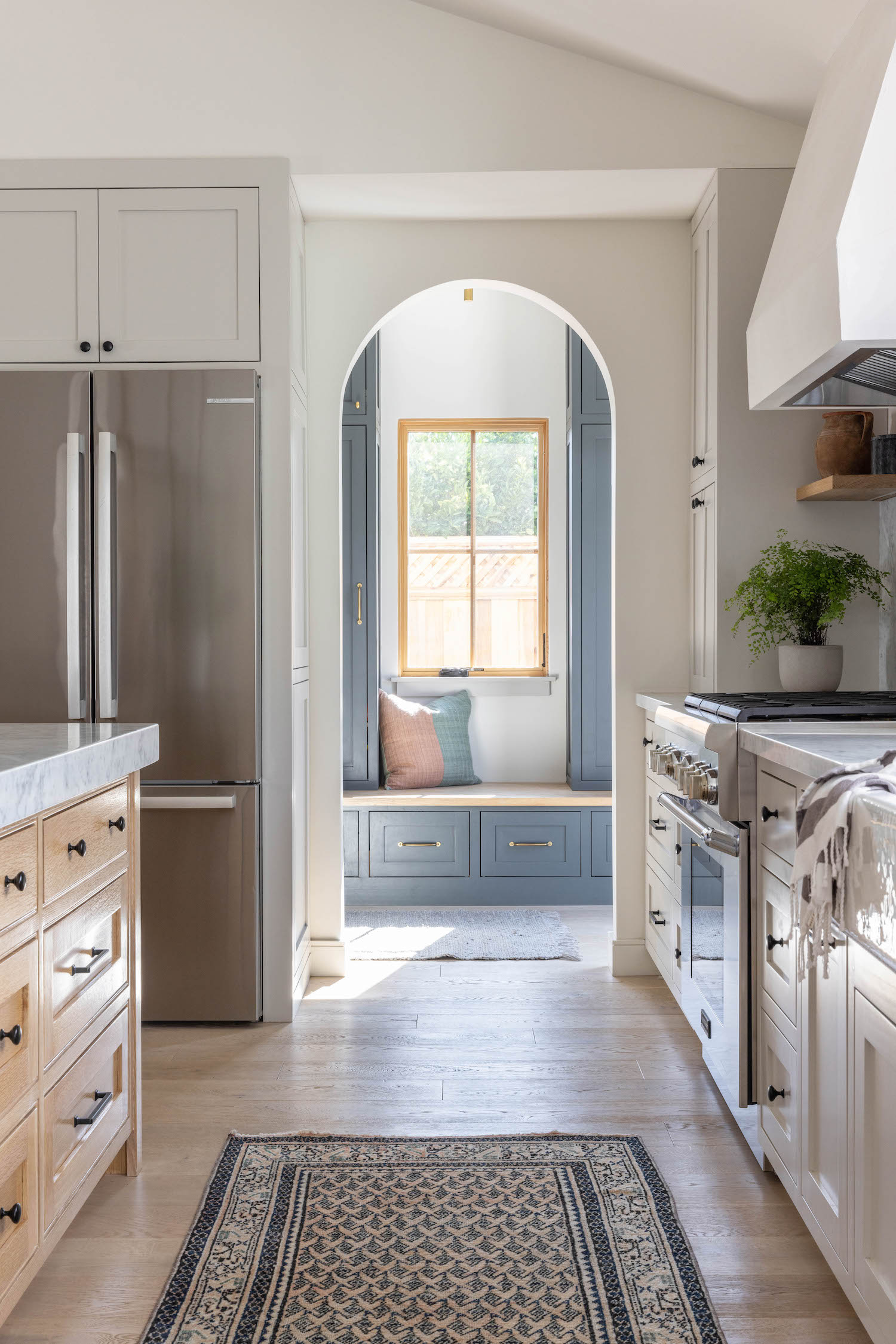
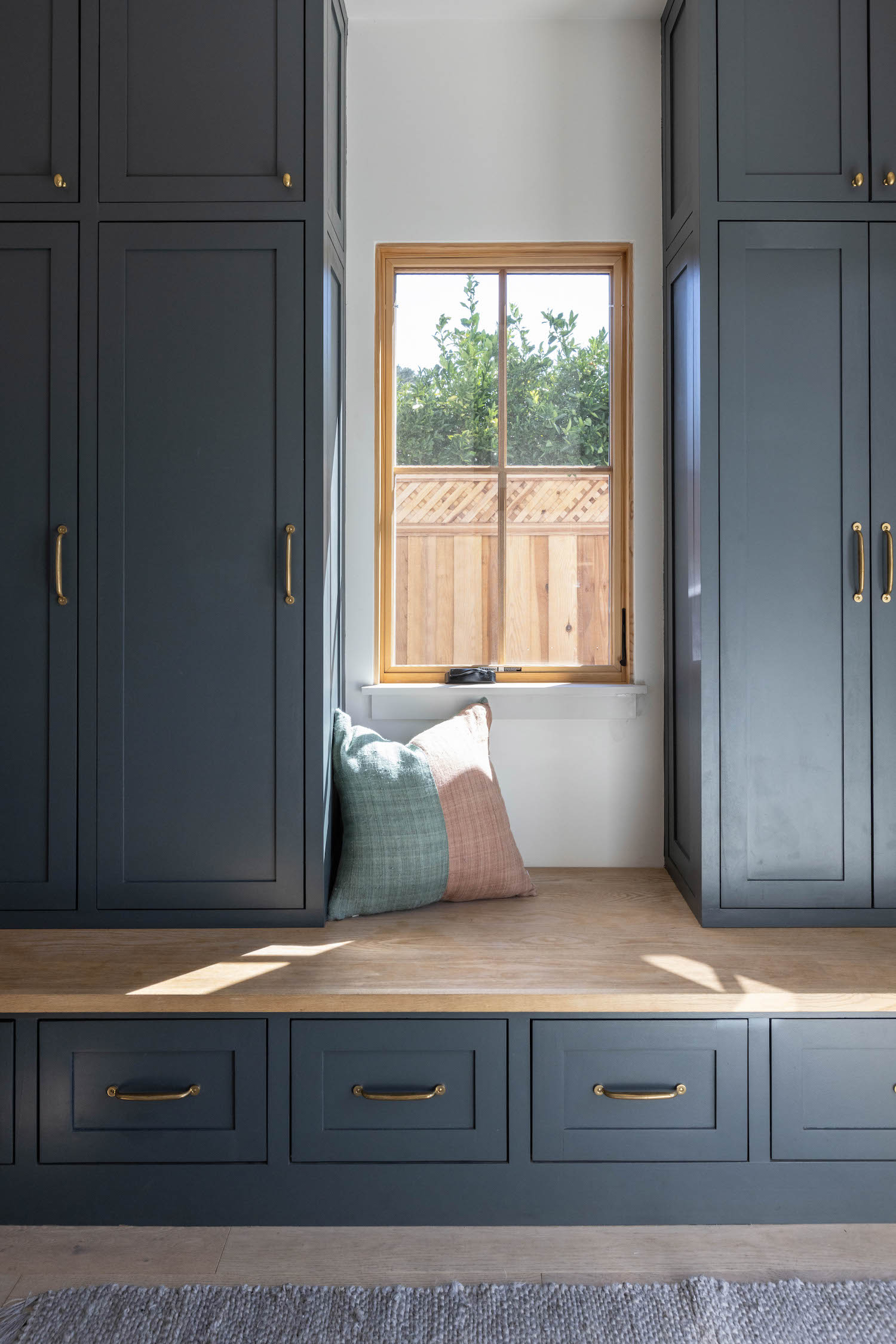
From the designer… This project was a full remodel of a 1950’s home. Previously, the home was dark and separated by many unnecessary walls. There was a galley-style kitchen – the “one butt kitchen” – with space for just one person. I wanted to design the space to feel more open, warm, and inviting. This property was on a large lot. The goal was to blur the line between inside/outside living, creating a great space for entertaining and hosting family and friends. I wanted the kitchen to be the heart of the home. It was essential to have a line of sight into the other areas of the home such as the family room, mudroom, living room, dining room, and the backyard. Having a space for two school-aged boys to enter the house and unload was critical. That is why we added a mudroom and powder bath to the back entryway.
A unique feature of the property was that it had a long driveway to a detached garage. Being transplants to California, it was an opportunity to convert the garage to a tiny house which is referred to as The Casita. This would be a place to retreat or host guests visiting from out of town. It was also where the family lived during the renovation of their main house. A family of four living in a small space was truly a challenge when the pandemic hit in the midst of the renovation. However, we are so happy with the results.
Like what you see? Take a peek at the talent behind the story… Interior Design: Rise Up Home · Photography: Lauren Andersen of Sen Creative · Stylist: Sarah Schulweis of Sen Creative