Classic yet fresh and sophisticated yet unfussy, the kitchen and mudroom we’re touring with Meg McSherry Interiors today embody the New England vibe we so love. From the subway tile to the perfect paint selections to the lighting, there’s no shortage of charm here, and Sarah Winchester Studios captured it all. Join us as we walk through with Meg to unveil the details (including those paint colors we know you’re on the hunt for!).
Take us back to the start—how did this project make its way to you and what were the goals for this kitchen and mudroom?
We are fortunate to get a lot of work by word of mouth! This client heard of us and approached us to help with their renovation and addition. They had lived in the house for several years, contemplated moving, but ultimately loved the neighborhood and the bones of the home.
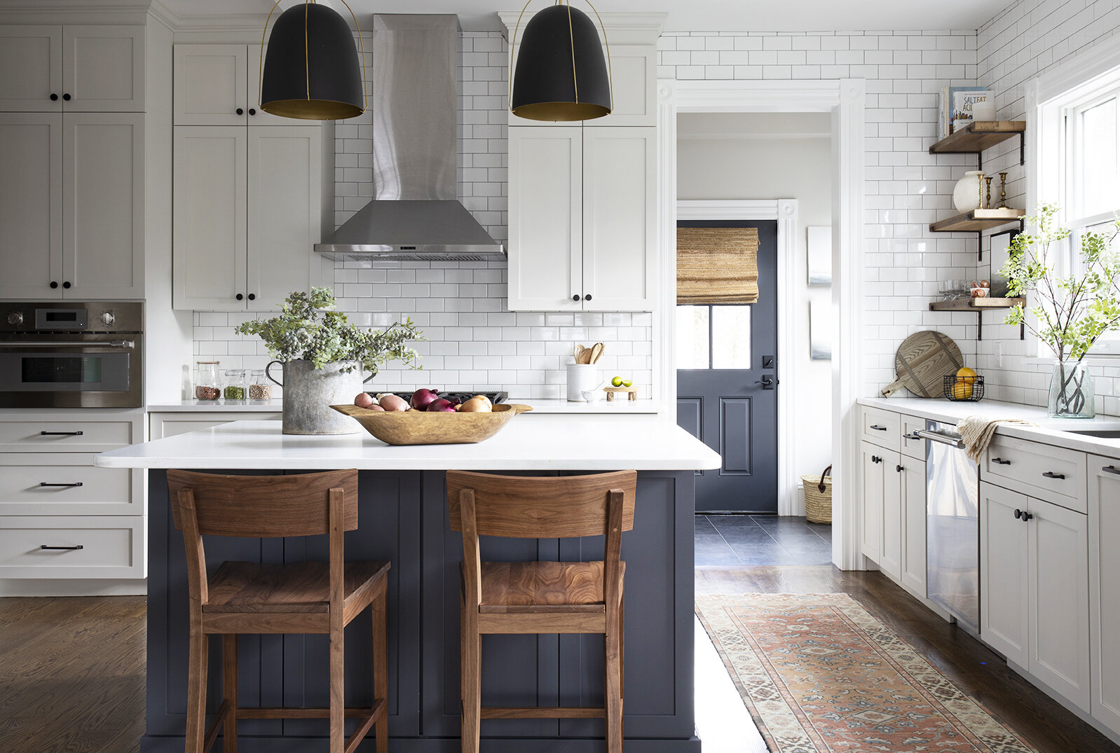
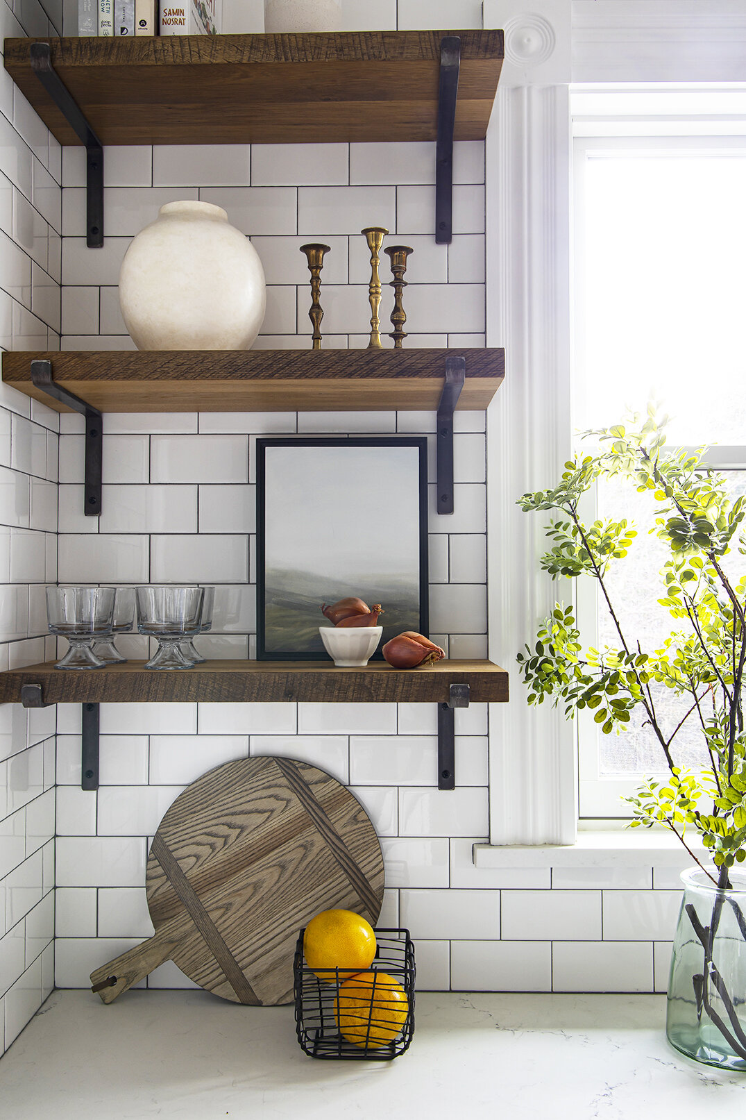
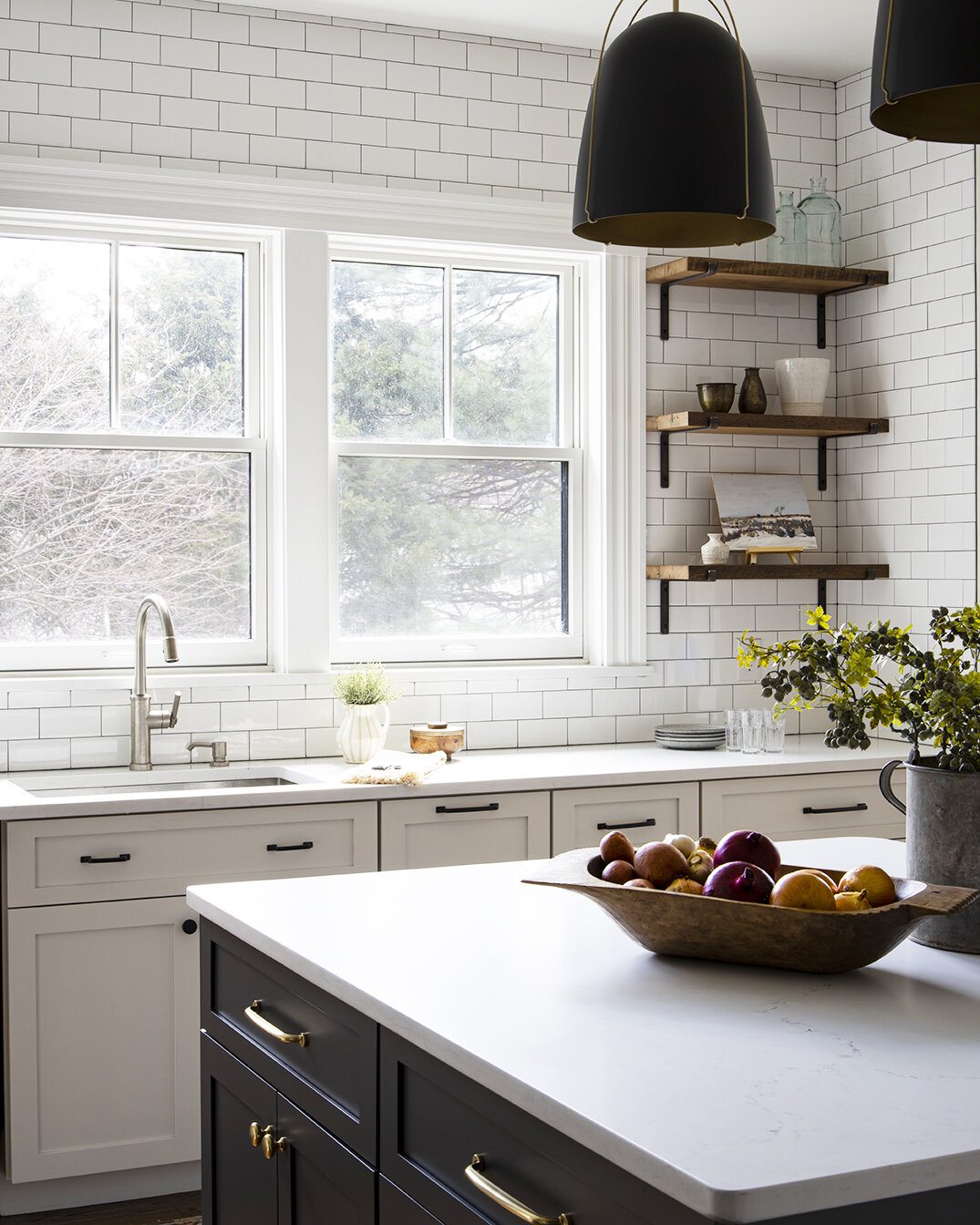
The husband is a big cook and needed a functional and efficient cooking space. Like many families, they also wanted the kitchen to be a natural spot to congregate and enjoy throughout the day. The back of the home gets amazing light, we wanted to take advantage and get as many windows in the kitchen as possible, we were willing to sacrifice upper cabinets to do so! Now, the wall of windows and open reclaimed wood shelves are such an amazing feature of the first floor.
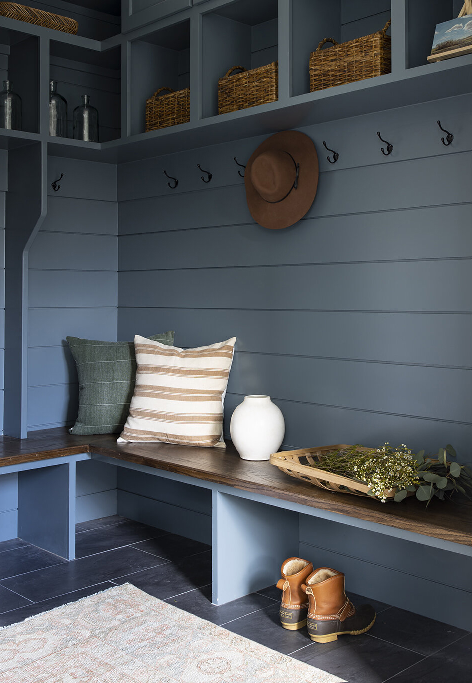
Anyone who lives in New England knows how important a mudroom is. We get all four seasons here, which means we have everything from sunscreen, drippy snow boots and muddy soccer cleats to contend with. This space was all about getting maximum storage with custom cabinetry. We saw it as a great opportunity to infuse some color in the home too.
The vibe in this project is classic, yet fresh. How did you keep things traditional, but current all at once?
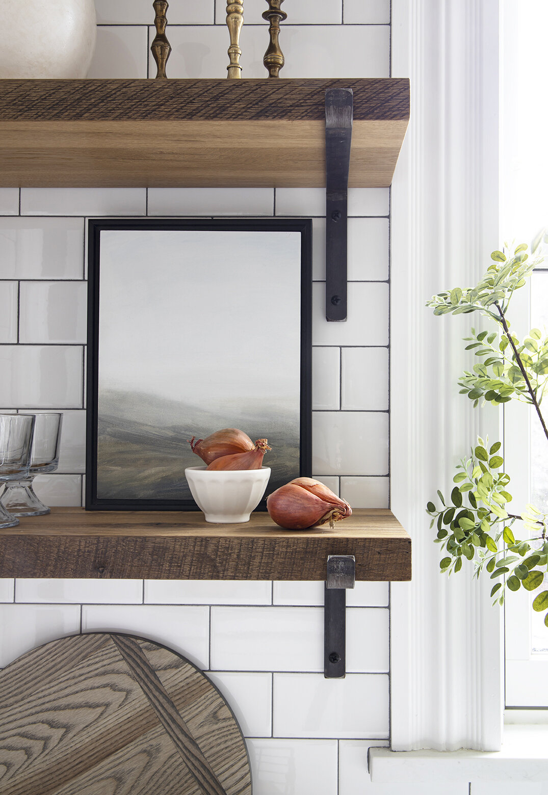
That is exactly what we were going for! We are pretty obsessed with all the details. We focused on finding some elements that went more classic while keeping the others more clean. You’ll see the kitchen cabinets are shaker and the backsplash is a 3×6 subway—you can’t get more classic than that! Yet subtle decisions like carrying the backslash all the way up to the ceiling, or using exposed metal brackets for the shelves, those details make it feel a bit more approachable and fresh.
What design element do you most look forward to selecting when it comes to kitchens?
Hands down, lighting. We are seeing kitchens that are really pushing the boundaries with lighting. It doesn’t just have to be pendants anymore! Sconces, flush mounts, a little of each…I think lighting is such a great way to infuse personality and make a real statement in a kitchen.
The paint colors you used in this kitchen and mudroom are so classic. Would you mind sharing the paint colors?
I’ve been asked so many times and am happy to finally share! The kitchen island is Benjamin Moore French Beret. You’ll see the mudroom door peeking from behind the kitchen is painted the same color. It is a very dark gray that can have blue undertones in certain light.
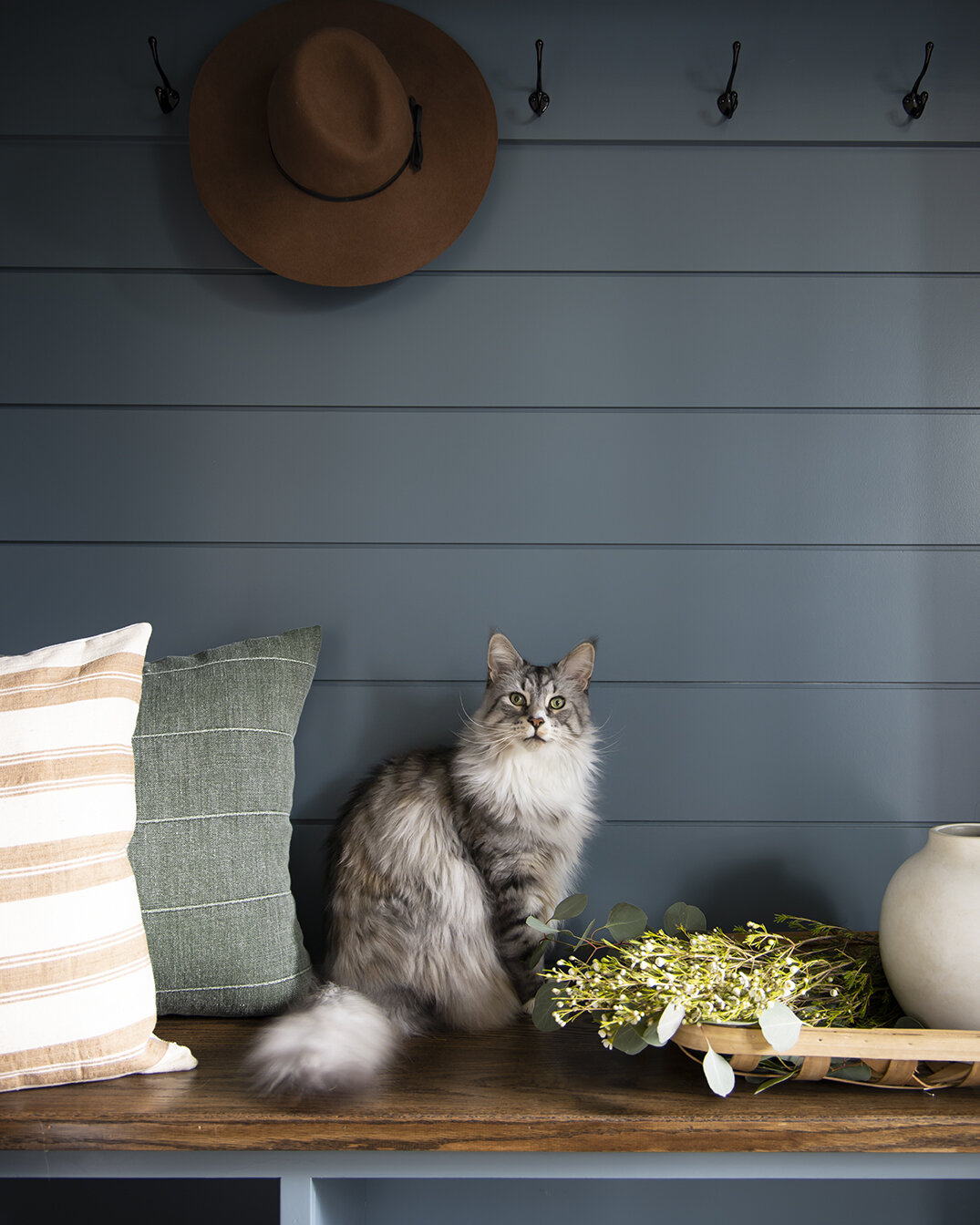
The mudroom cabinetry and paneling is painted Benjamin Moore Charlotte Slate. We selected the color towards the end of the project and it is literally perfect. It is colorful but not too saturated. It’s a new favorite.
Love what you see? Take a peek at the talent behind the story… Interior Design: Meg McSherry Interiors · Photography: Sarah Winchester Studios · Builder: Tom Finelli Building Inc.