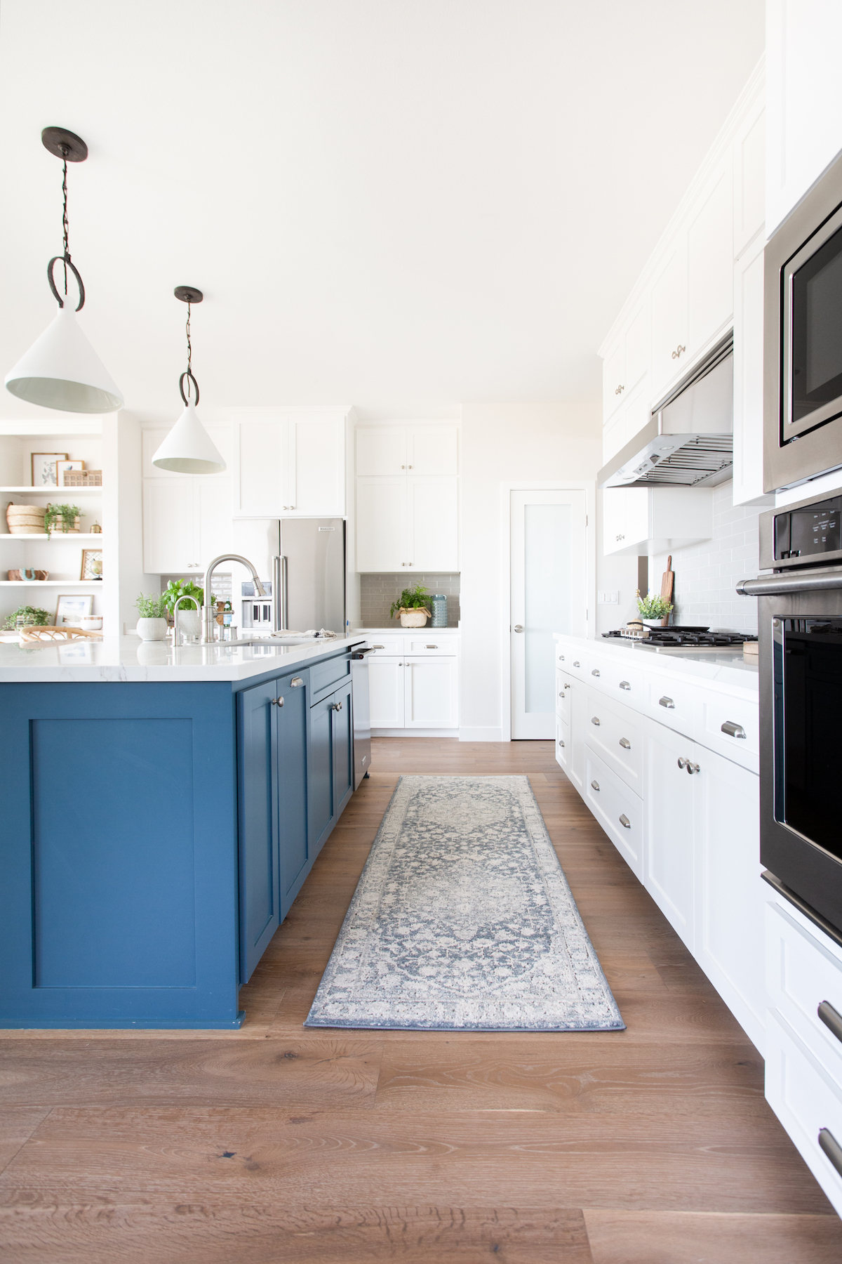
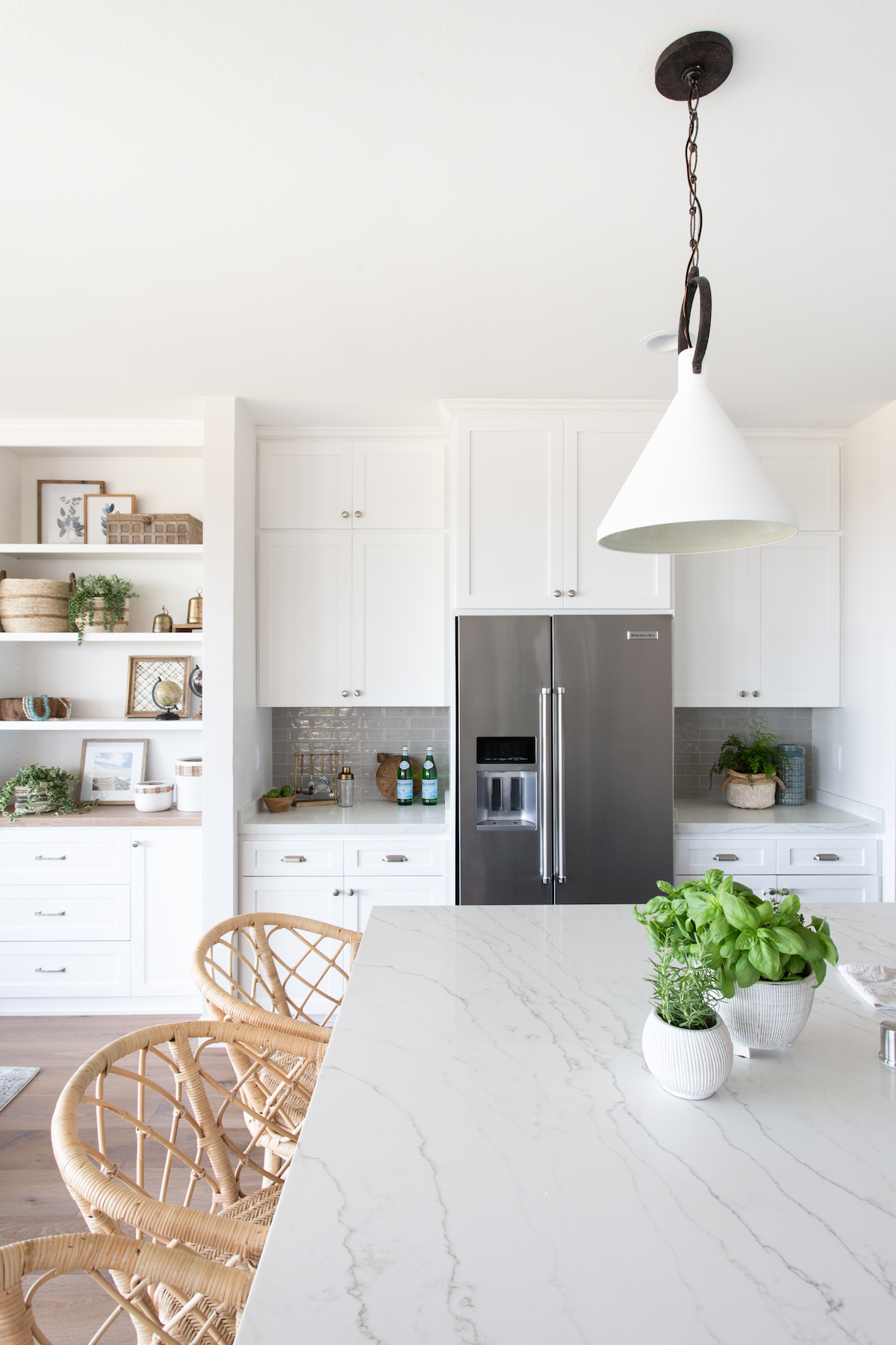
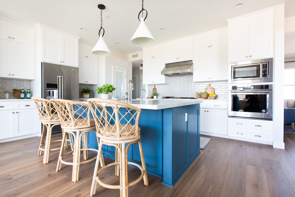
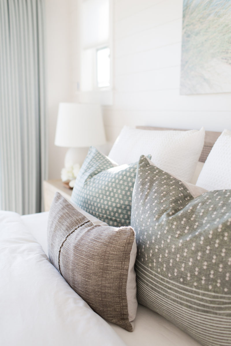
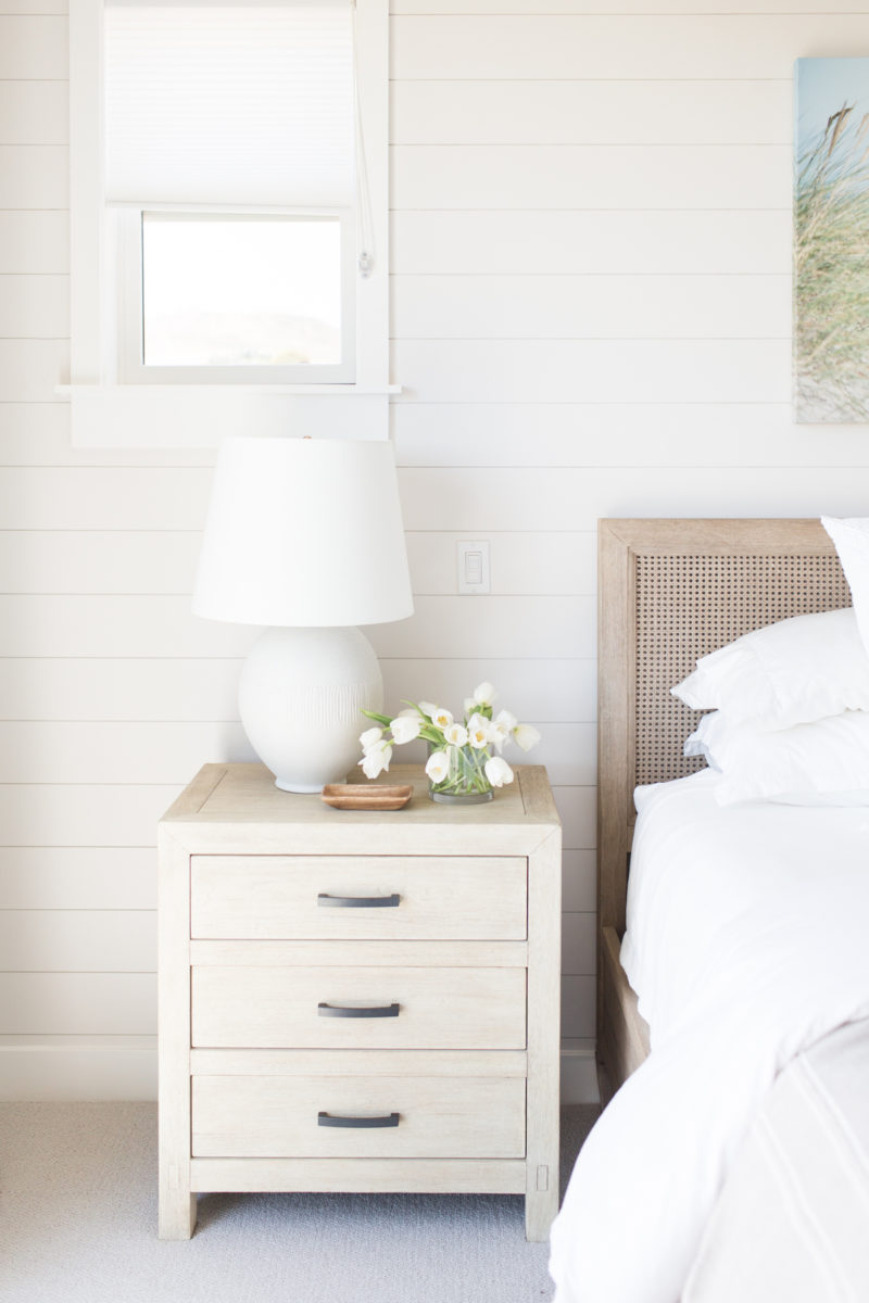
There’s an extra special combination when you meet a designer whose heart is as beautiful as her homes, and Madison Nicole Design is the epitome of just that. After evacuating her own home during the Thomas Fire in 2017, the architect-student turned interior designer vowed to use her talents to help others affected. Today, we get to tour the new abode of a family forced to rebuild. With the way she uses shades of blue and blends wooden tones, the end project feels serene yet cozy, reminiscent of the infamous Santa Barbara coastline. Grab a tissue box as you enjoy the photos of this pretty project captured by Lindsey Drewes – a Coastal Craftsman ready to create new memories for a well-deserving family.
Can you tell us a bit about the story behind the project we’re featuring today?
This home was actually rebuilt from the ashes of the Thomas Fire. It was one of about 500 homes in Ventura that burned to the ground in December 2017. It was a very personal project for me, because although I didn’t lose my home, we were evacuated that night as well. We left our home with the hills engulfed in flames and a sky glowing orange behind us. We were fortunate that our home was completely safe, but I’ll never forget that feeling of uncertainty. In the days following. I wanted so badly to help people who had lost their homes. I volunteered where I could, but I prayed that once people started rebuilding, I would be able to be involved with that process, because it’s what I do and what I’m good at, and ultimately where I would be the most help.
This client was the first one who reached out to me. We got lunch, she shared her story with me, and I remember fighting back tears as she spoke. It broke my heart knowing what her family had been through, but I was so shocked by how strong she was, and my admiration for her and her husband only grew throughout the design process.
This project was not easy because it was so different than most of my projects. These clients didn’t make the decision to remodel; they were left with no choice but to rebuild. So while there were moments where I felt excited about design presentations and what their home would become, it was challenging for them to look past what they had lost and to see what would be there instead. In the end, I think we did an amazing job working together and balancing all the emotions that come with a typical remodel, along with the additional ones from losing so much.
Whether it’s a particular room or specific piece of art, what’s your favorite element of this project?
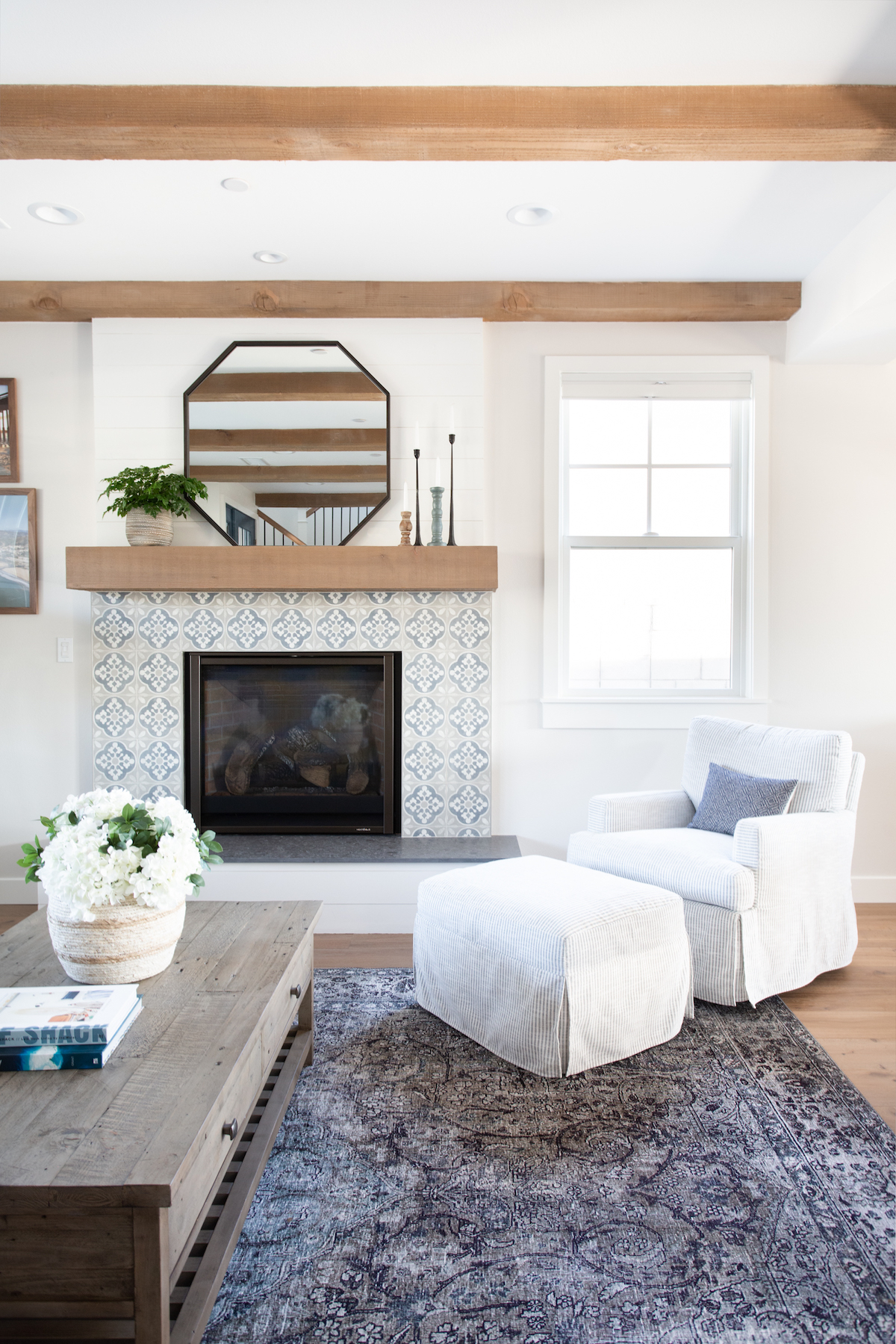
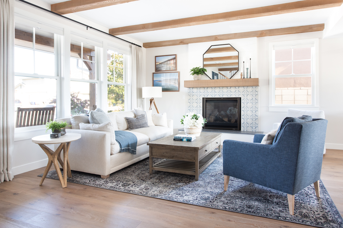
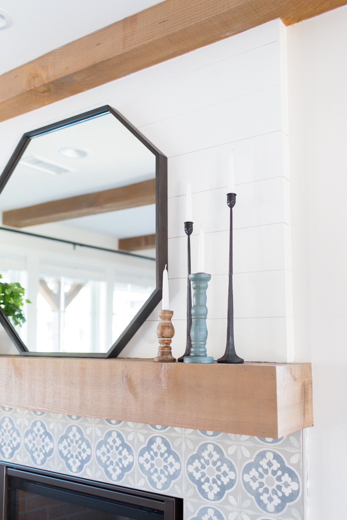
I love the fireplace! It’s one area that the client was a bit unsure of, but I asked them to trust me, and they did. Now it’s one of their favorite elements, too! Pattern can play such a fun role in spaces.
I’m never good at picking favorites, so I have to include the master bedroom in here, too. They asked for a serene space, and I’m so proud of how it turned out!
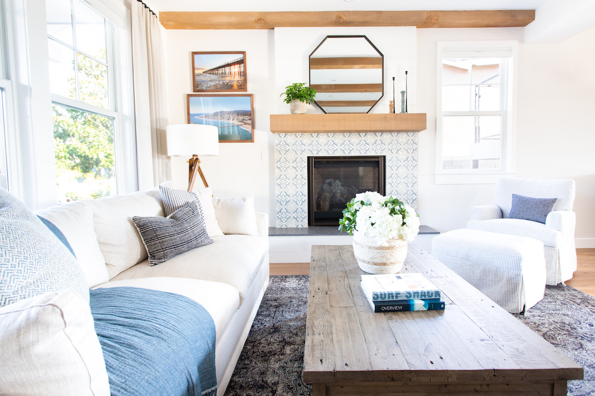

We love the pops of blue found throughout this project! How do you achieve the effortless-looking but often challenging balance between making the full project cohesive yet keeping the design fresh in each room?
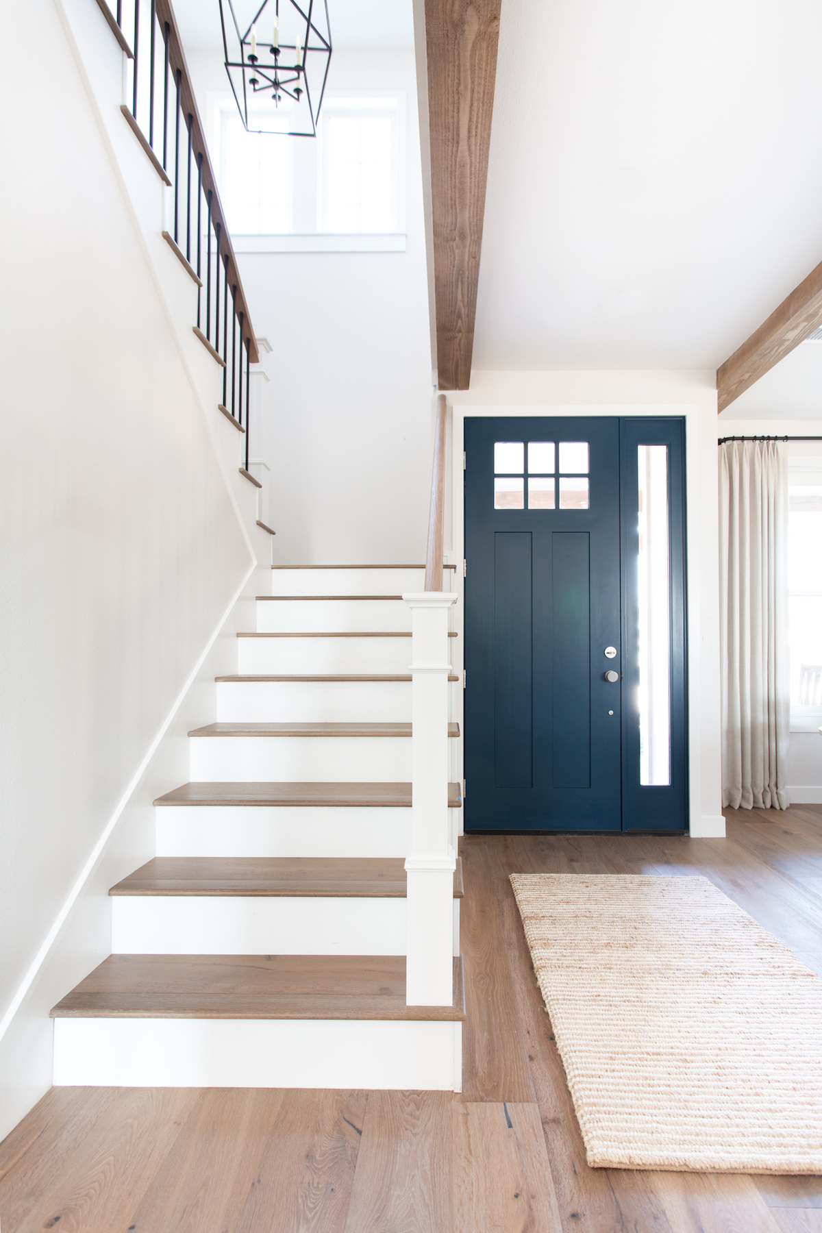
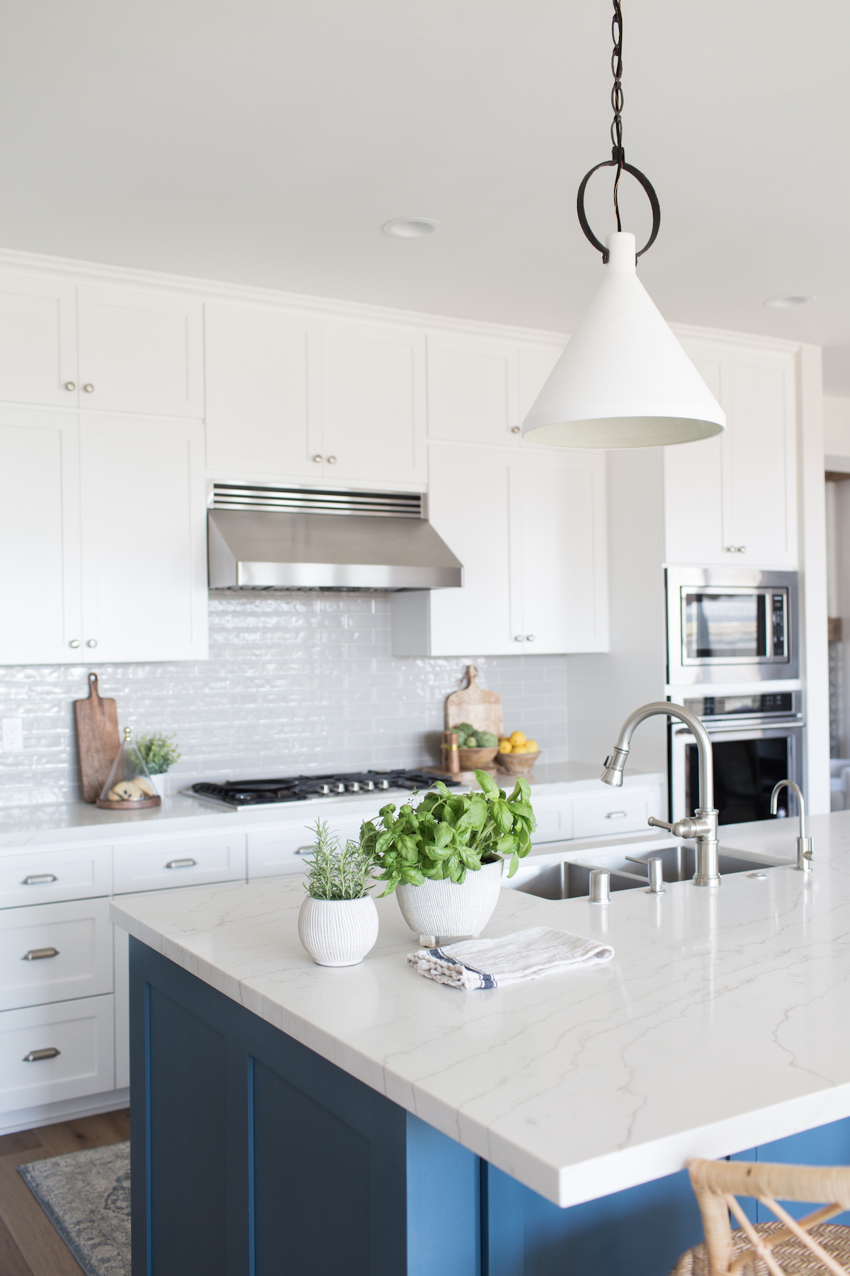
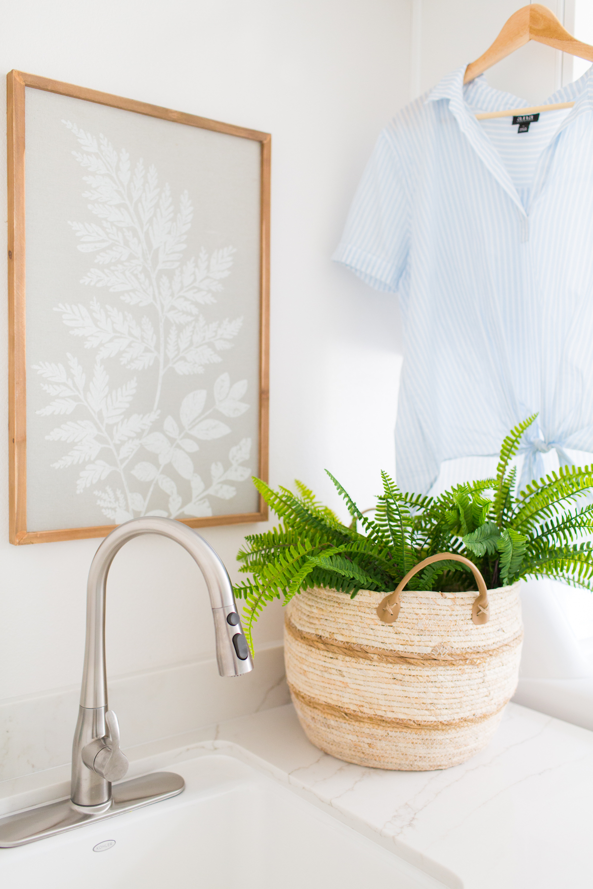
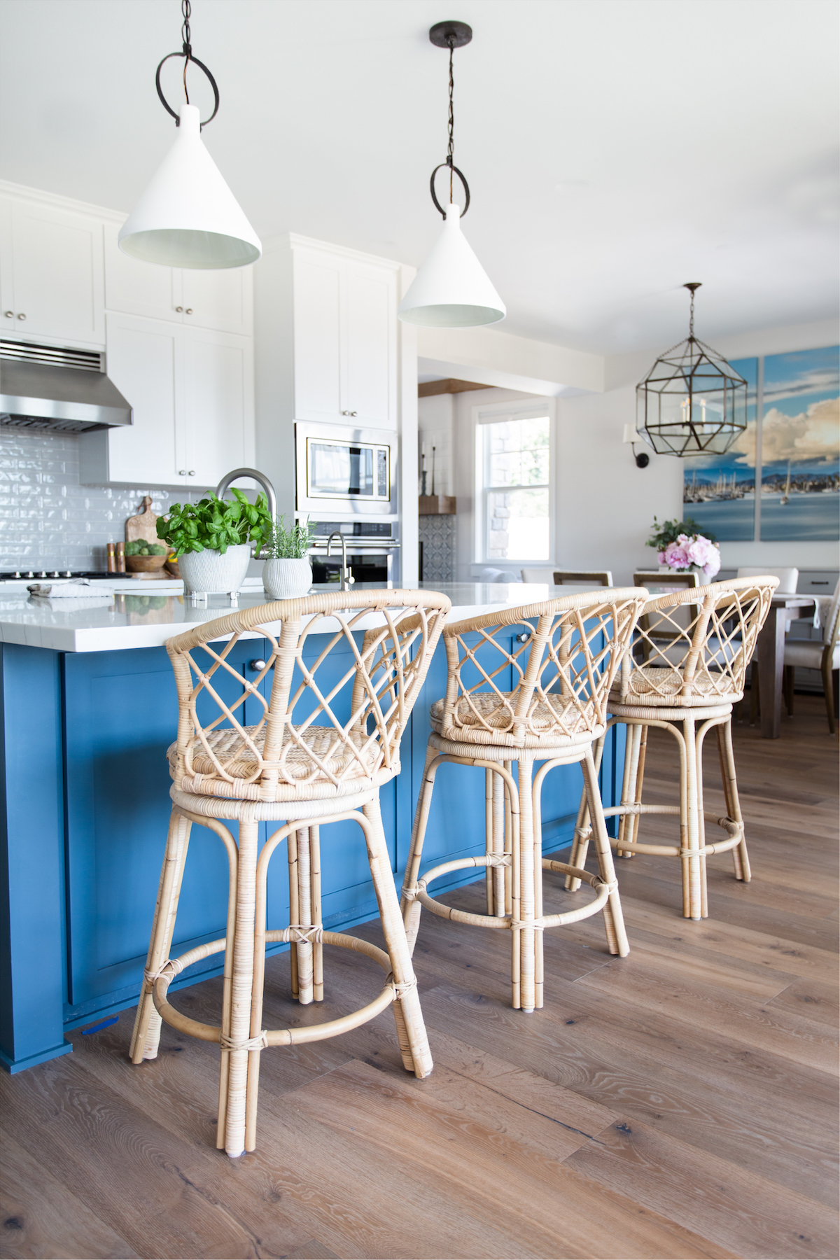
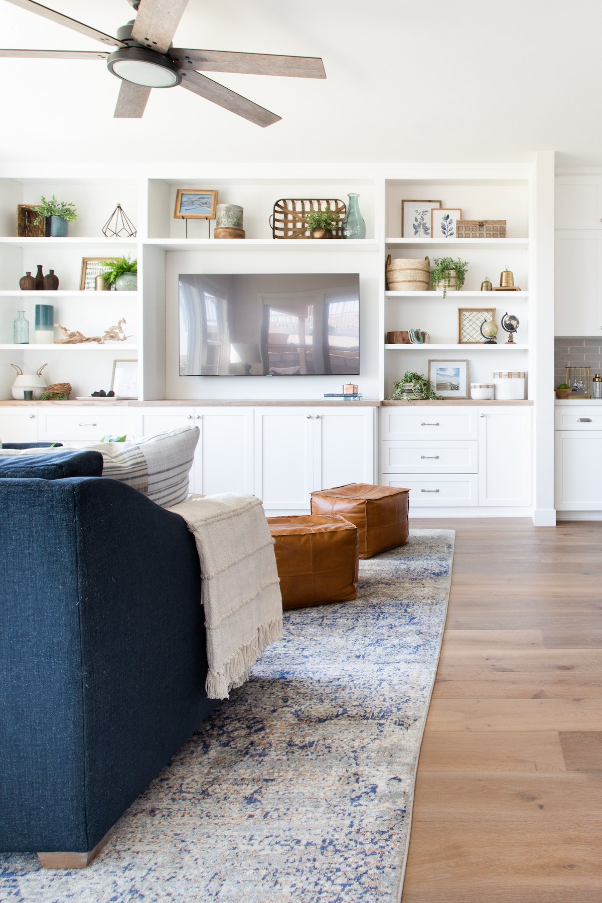
The key is to carry certain design elements throughout the home. We have different shades of blue throughout, but we also play with a lot of texture as well. The wood tones are all pretty cohesive, and I think having just a few unifying elements in each area of the home is what makes it feel the most harmonious, while still being able to give each room a fresh spin.
Our websites and branding serve as the “houses” of our businesses – and yours recently underwent a redesign! What served as the inspiration behind your new brand and website? How did the creative process differ from – or mirror – designing an actual house?
Yes! The ladies at IDCO did a wonderful job with my branding and website design, and I’m still giddy over it! I wanted my branding to represent my design aesthetic, so it’s equal parts coastal, casual, and collected. I like to include a few unexpected elements in each design that give more character, and there are some great hand-drawn elements in my logo (like the wave with my initials in it) that make it feel more unique and special.
It was so fun to go through the design process as a client. There are definitely quite a few similarities. We started with some lengthy homework on my part (which made me realize I should be requiring more homework from my clients, too!), both in answering written questions, but also a curated Pinterest board that showed the feeling that I wanted my brand to evoke. It was a great process for me to really curate something that I felt represented Madison Nicole Design.
You started your career by receiving a Bachelor of Architecture. When did you make the switch to Interior Architecture and Design? What inspired the pivot, and how does your first degree and work experience inform what you do now?
It was actually my plan all along! I knew at an early age that I wanted to be an interior designer, but I was pretty adamant about studying architecture first. I wanted to have a better understanding of how buildings functioned as a whole and how all of those details can affect the quality of the interior spaces. The five quarters of structural engineering classes almost did me in, but I stuck it out, and I am so happy that I did. I’m able to read and draw architectural plans, talk to and understand contractors, and have a general idea of what is going on under the paint and drywall because of my architecture degree.
One of my professors encouraged me to continue school and told me about the Masters degree in Interior Architecture that was offered by UCLA Extension. I took her advice, and enrolled in evening classes while I was working for an architecture and design firm in LA. The extra education while simultaneously gaining experience in the field was such a huge help for me. Yes, I have more education than you technically need to be an interior designer, but I credit a large portion of the growth of my business to my education. Looking back, I would still do it all the same!
I think that the role of the interior designer is minimized so often. Ninety percent of the time, when I tell someone what I do, I get a response about how “fun” it must be to spend other people’s money or to shop all the time. While I absolutely LOVE what I do, I get frustrated by that. So many wonderful, well-known designers don’t have a formal education, and you can definitely grow a strong business without it. But for me and my business, it was just what I needed!
We’ve heard about your love for gardening and floral design! Does that show up in your projects?
Absolutely! When I first started Madison Nicole Design, I actually wanted it to encompass interior design, floral design, and event design. But after that first outdoor wedding in 110 degree heat, I made a quick switch to focusing only on interiors.
While I love event design, I prefer my stress to be spread out throughout the length of an entire project instead of all focused on a singular day! I still break out my floral skills for project reveals and photoshoots, and that’s enough for me!
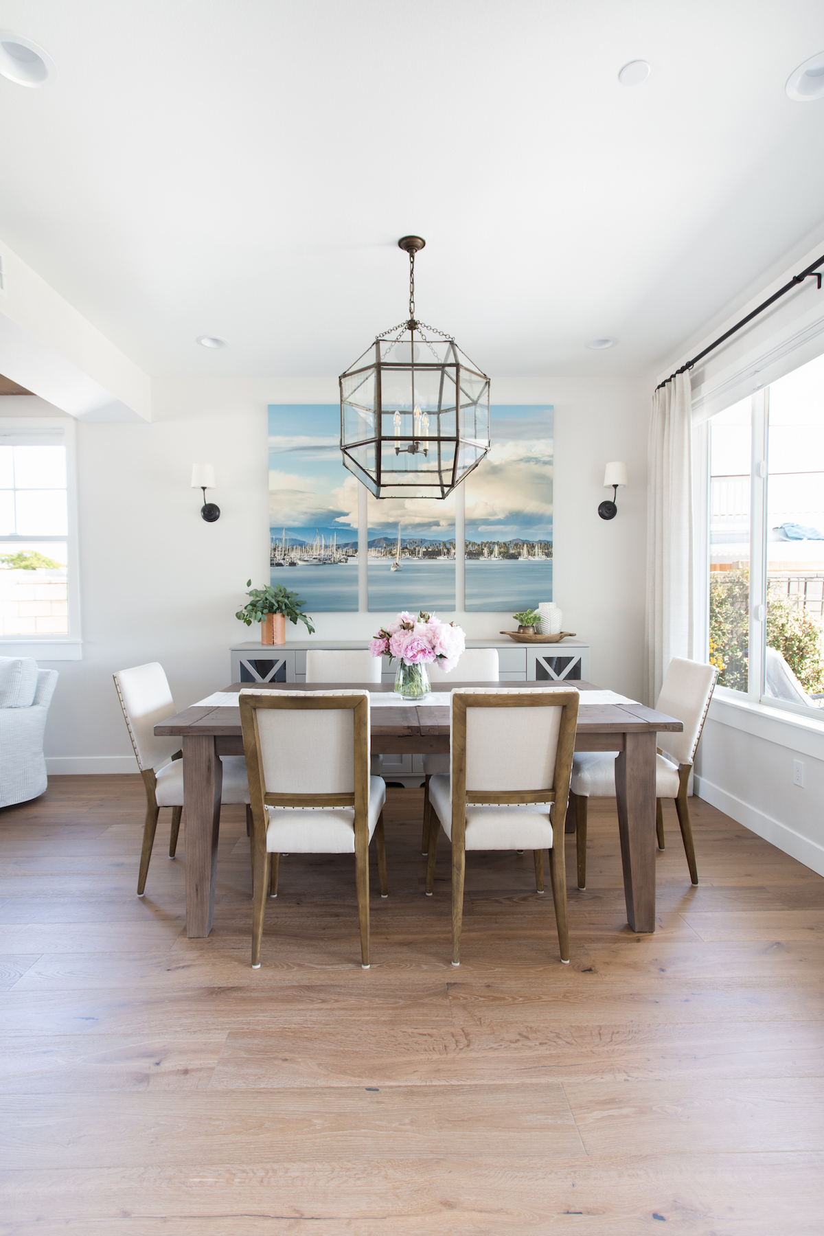
You live in the gorgeous Santa Barbara area and credit the landscape for inspiring many of your designs. What are some examples of how you interpret Santa Barbara in a project?
The Santa Barbara landscape does inspire me literally, but I think it’s more the feeling that you get from being in this coastal town that I try to translate into my designs. It’s the ocean breeze, the salty air, and the overall feeling of calmness. So many people come to this area to relax, and when people step into a home I have designed, I want them to experience the same feeling as when you take a deep breath of the ocean air, and then exhale it fully. There’s something there that you just can’t put into words!
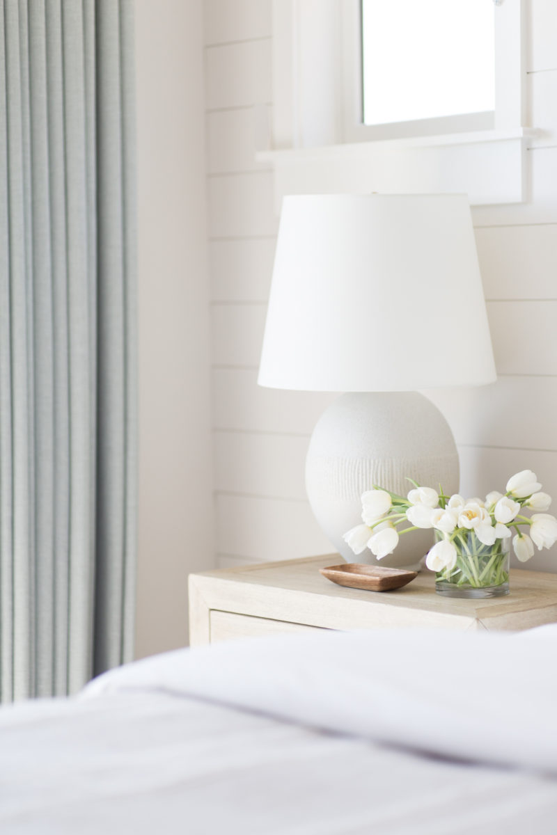
If your design style was a cocktail, what would it be?
Lemon drop. Tito’s vodka. Sugar rim. Classic. A little sassy, a little sweet. Gets the job done!
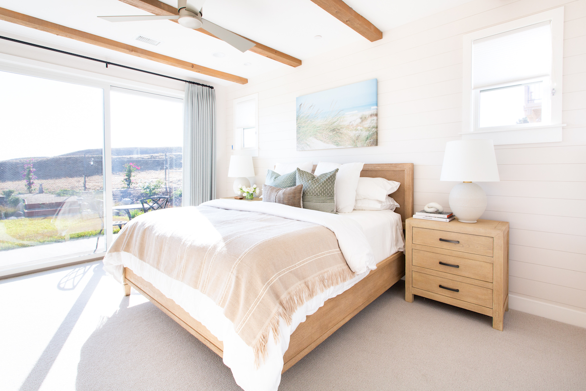
You’ve said that homes should be as easy to live in as they are to look at. What practical considerations do you keep top of mind when designing a home that’s “easy to live in”?
I had someone in my own home recently, and they literally asked me if it was okay to sit on one of our counter stools. I looked at him with such a puzzled face. He responded, saying everything was so pretty, that they might have just been for looks. How bizarre.
Homes are meant to be lived in! I never want to put something in a home that will break if you look at it wrong, or stain if you spill some water. It’s just not practical. We source performance fabrics that are durable, stain resistant, and will hold up to an active family. Our rugs are made out of durable fibers instead of ones that will break down and look awful after being walked on.
We spend a lot of time talking to our clients about how their family lives so we can design around that. So many of my clients tell me that they don’t have nice things because of their kids, but I’m here to tell you that you can have a beautiful home, you just need a designer who knows what they’re doing and is able to design with your lifestyle in mind.
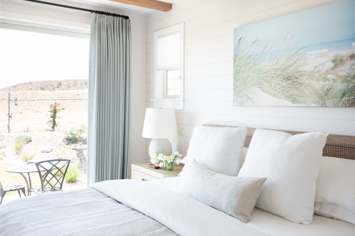
What does a well-lived home mean to you?
A well-lived home is one where beautiful memories are made. One with spaces that easily accommodate the entire family or allow for entertaining friends, all while not being concerned about covering the white sofa in case someone spills. Everyone deserves a home that serves as the backdrop to a life well lived.
Love what you see? Take a peek at the talent behind the story… Interior Design: Madison Nicole Design · Photography: Lindsey Drewes Photography · Builder: Kenny Kuhnhofer
